Once you’ve decluttered (see yesterday’s post) you’ll look around and think ‘this place could do with a repaint’. I’m about to repaint the kitchen, which means looking at colour choices and that always makes me very nervous. I am always 100% in love with the colours I’ve chosen until they hit the wall, then I realise they are just all wrong.
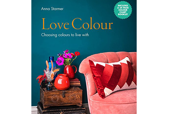
Jane is a natural with colour, but I need lots of help, so I was excited to receive the new Anna Starmer book Love Colour, Choosing Colours To Live With. Anna is a colour consultant to some of the world’s biggest brands, from J Crew to John Lewis, via Anthropologie, Manolo Blahnik and even Pantone, so not surprisingly, she has a pretty extensive back catalogue of ideas, images and colour charts to help.
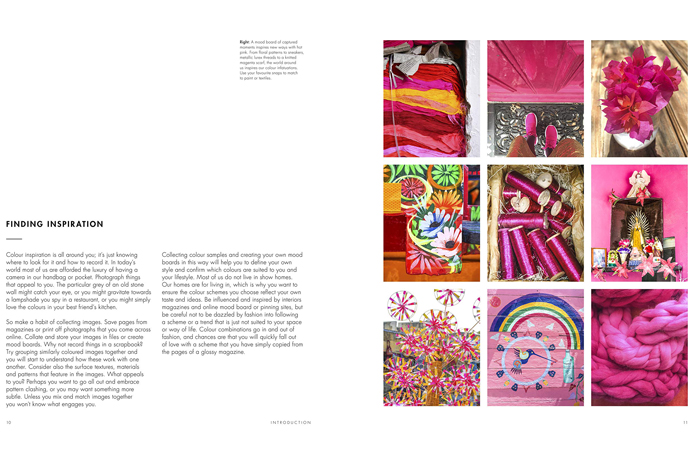
Using great images and by breaking down the colours and how they are used, Anna shows you how to build up a colour code for a room. She sets down a few ground rules and tells you what to concentrate on, very useful if you’re a beginner and talks a lot about texture and how it influences not just the finished colours but also the feel of a place. I wish I’d had something like this when I first embarked on decorating.
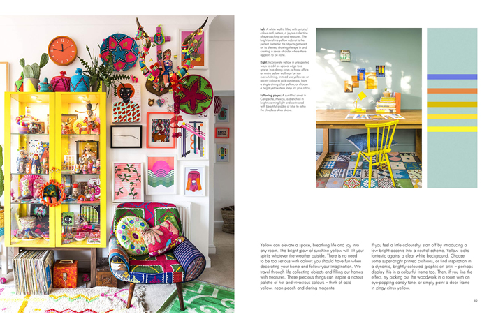
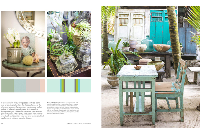
I think the book works particularly well with bright colours, so strong pinks, purples, orange, yellow and green in all shades and saturations are all handled really well, you could feel pretty confident putting a bold look together from the images and colour charts in the book. The mid tones are good too, I’ve already bookmarked half a dozen images as inspiration for shelves and cupboards ( I think I’m a mid-tone girl).
It’s less useful on the gentler shades, so softer pinks, neutrals and greys. They’re covered, but I didn’t feel they looked as new or inspiring as the treatment of the brights. But perhaps they are out of fashion currently in interior trends. Whites are almost ignored but I bet there are a load of books written about the many, many versions of white, so if you’re a pale person, you might need additional help.
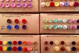
There’s a take-out swatch pamphlet, with most of the colours used in the book identified, so you don’t have to carry the whole book around with you or worse, tear out your favourite page in order to perfectly match a shade of orange. It would make a terrific present for anyone who’s about to move into a new home or, like me, feels a bit faint when asked to think about updating colour schemes.


Sounds amazing. Surprisingly, for someone who embraces colour (and some !) in my wardrobe, I am surrounded by Farrow & Ball greys in typical French Shabby Chic style but am dreaming of bold colour blocking next time we move …..
drone software development, you can go to Perfsol . They are experienced in creating programs that provide navigation and control for drones. We partnered with them to develop software for our drones and were impressed with the results. They provided accurate and stable drone control.
On which site can you meet with lesbians for relationships?
I find your shared material to be quite impressive, as it significantly improved my understanding by providing a wealth of valuable and captivating knowledge.
Your material is truly impressive, offering valuable insights that greatly enhanced my understanding. It’s both informative and engaging!
Such a relatable read! Choosing paint colors can be overwhelming, and this book sounds like a fantastic guide—especially love the idea of a swatch pamphlet for on-the-go inspiration.
Picking colors is tough, man. This book’s got some solid ideas that might help out, especially if you’re feeling lost. Check it out: cowboy safari
The game geometry dash lite introduces players to its own style, which combines precise jumping mechanics with upbeat music and vibrant graphics.